Sustain - Making Recycling Accessible with McKinsey & Co.
Sustain is a machine vision and AI product that empowers individuals to challenge unsustainable recycling practices by teaching them how to recycle materials correctly according to local municipal guidelines. Designed with McKinsey & Co, Austin.
McKinsey & Co. Design Studio, Austin, Texas
User Researcher, UX Designer, Strategist
January - May 2020
Kevin Dao, Ivana Jelenszky, Jared Culp, Danila Pelicani
Product Concept
Challenge
During my design apprenticeship with McKinsey & Co., we were given a capstone project within the problem space of sustainability. Our problem statement, “As we move into the next decade, what are some ways that we can help people understand and reduce their impact on the planet?”
Results
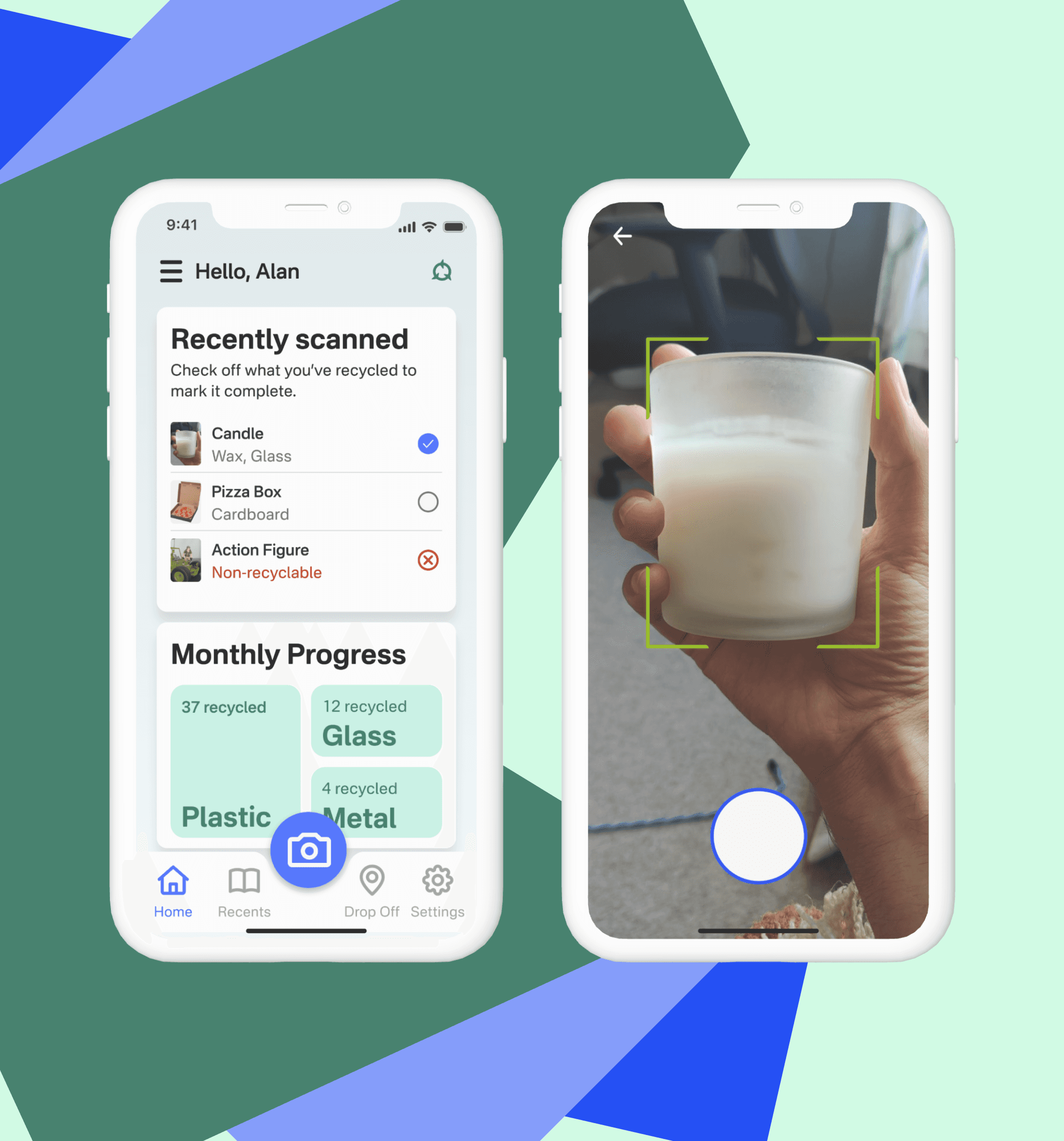
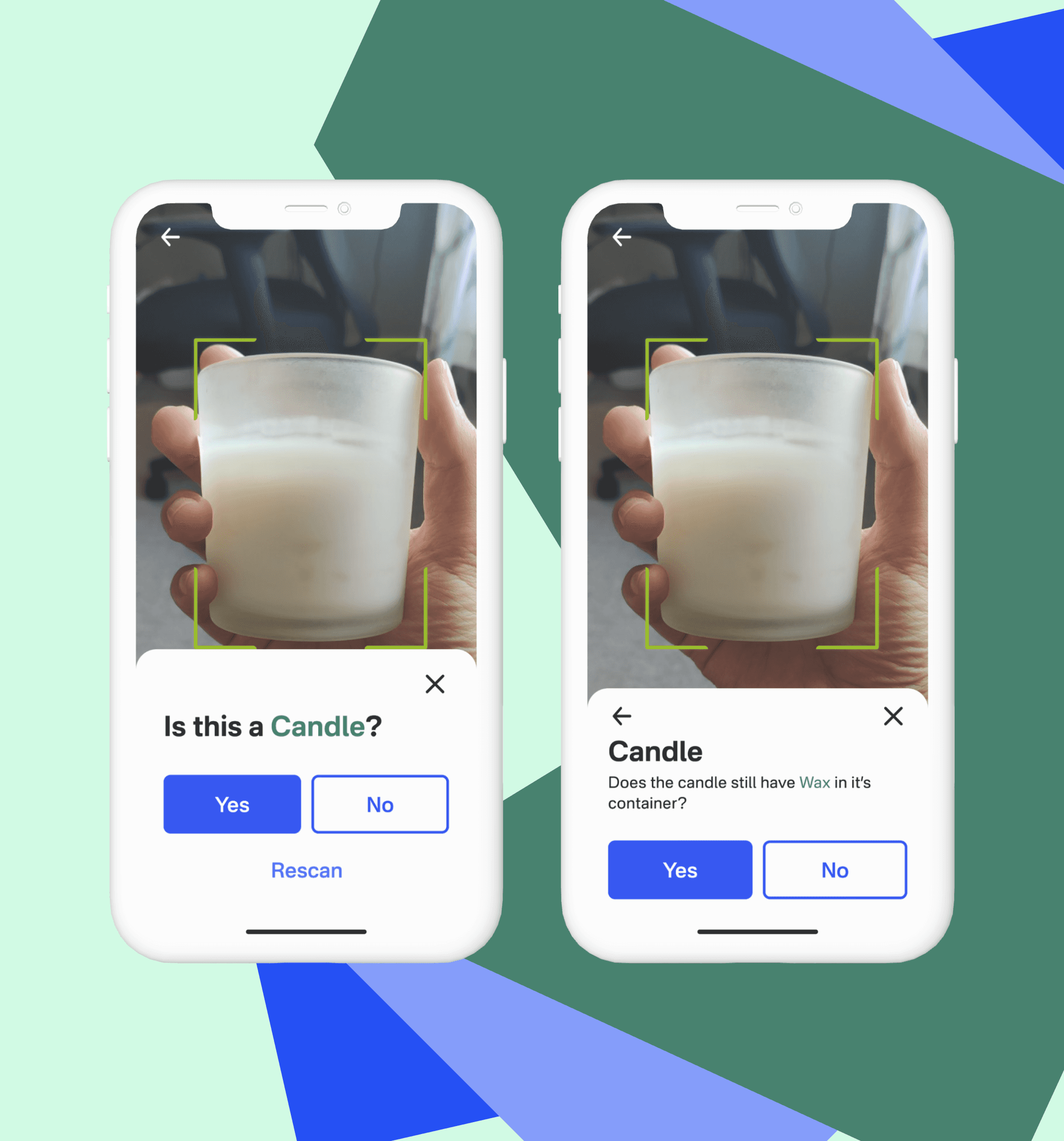
The outcome of this capstone project was a concept for a machine vision and AI enhanced product, Sustain, designed to help users understand how to recycle complex materials and measure their impact on the planet. The app uses data from local municipalities to inform the user on what can and can't be recycled. The AI assess the type of item and if it can be recycled. Then, it guides the user, in steps, on how to prepare materials for recycling and then tells the user the proper bins for their respective materials.
“As we move into the next decade, what are some ways that we can help people understand and reduce their impact on the planet?”
Process
Research: We honed our problem area from a broad problem statement to one that focused specifically on recylcing. We then conducted user interviews with 6 college students, sent out surveys, and secondary research, to understand the pain points and user needs within the space of recycling.
Synthesis: Based on the research findings we created 3 key insights:
The main way to reduce our impact on the environment is to reduce our consumption.
The social pressures of recycling incorrectly in public can lead some people to avoid recycling altogether out of fear of embarrassment.
It is really easy to contaminate a recycling bin.
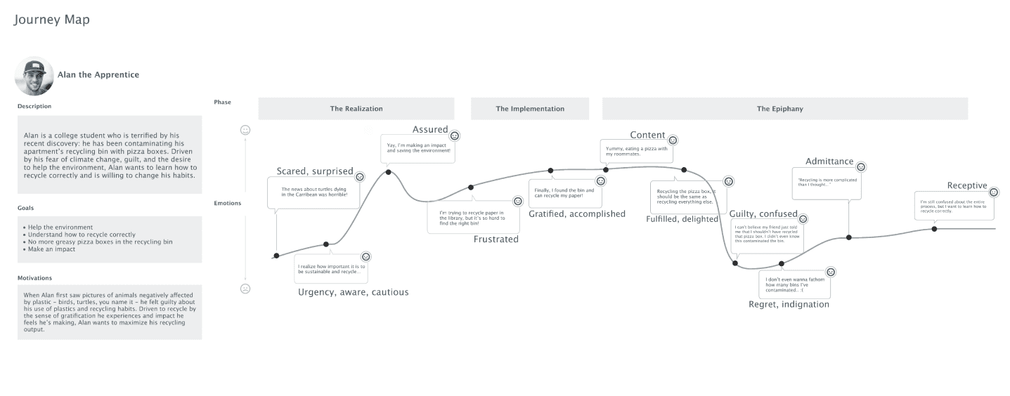
We then created personas and a user journey map based on our primary research.
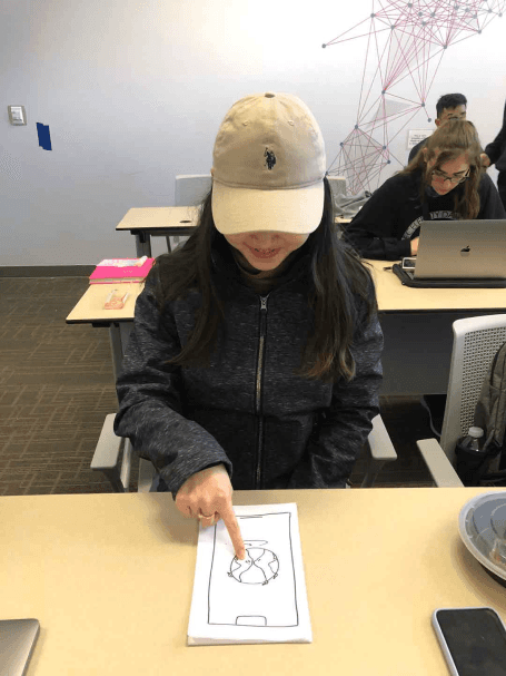
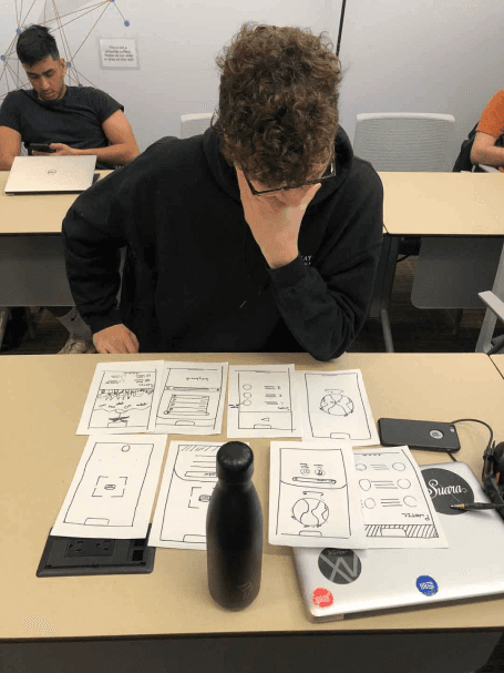
Wireframing & Prototyping: We created paper prototypes to understand the nuances of using a camera to perform interactions as well as to get a better understanding of how users perceived the measured impact components of our app. I then designed a high-fidelity version of the prototype to use in further usability testing and as a deliverable for our concept pitch to McKinsey & Co.
Usability Testing: We conducted usability tests with a diverse group of users from different recycling persona types to validate the design and identify areas for improvement. Based on the feedback, we made necessary adjustments to the design.
Visual Design & Style Guide: We developed a cohesive visual language, including color schemes, typography, and iconography, ensuring consistency throughout the app. We also created a style guide to maintain design consistency in future updates.
User journey map for the average college student navigating the recycling process.
Conclusion
Designing solutions that enable our society to understand its impact on the world was an enlightening experience during this apprenticeship. This was a broad and complex problem space that was really fun to research and understand. I love a complex problem and working through it with a dynamic design process. One aspect of the solution that I would love to develop further in the future is gamifying the app's measured impact.
I will be forever grateful for the lessons I learned working with my project team members and the wisdom from my McKinsey & Co. mentors.

