Organizing Complex Patient Data for Action with PatchRx
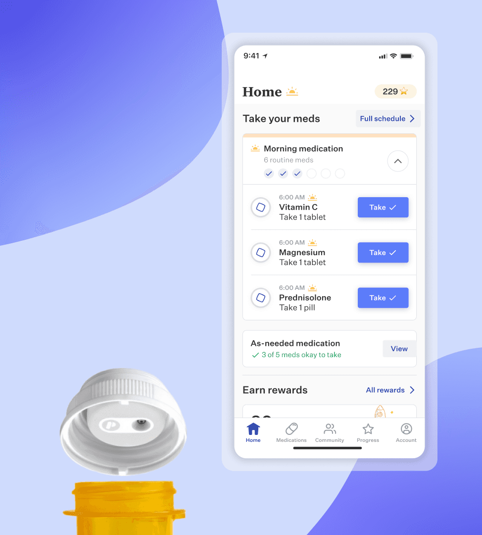
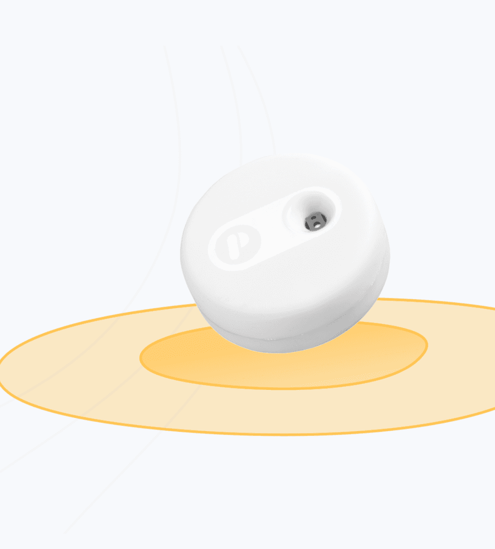
PatchRx addresses missed medications impacting patients and improving health outcomes. The startup employs its product suite, the PatchCap, and PatchRX web & mobile applications, to track complex patient data and notify primary care providers of actions to take to improve medication adherence. I served as a designer for PatchRx's web & mobile applications, launching a new product in the cutting-edge remote-therapeutic monitoring space.
UI/UX Designer
User Research & User Experience Design
Med-tech
12
July 2021 - March 2022
Challenge
Initially focused on medication adherence tracking for pharmacies, PatchRx aimed to broaden their product range and target audience. A new market for primary care providers tracking high-risk medication therapies had opened up with the introduction of new government reimbursement programs for tracking medical data. We had the technology to improve health outcomes and provide a new revenue stream for primary care providers but we needed to pivot our software's offerings and create ways for providers to manage their therapies and be billed for it as well.
Our design team's challenge was: how can we adjust our product to empower primary care providers in achieving improved health outcomes for their patients and receive compensation for it?
Results
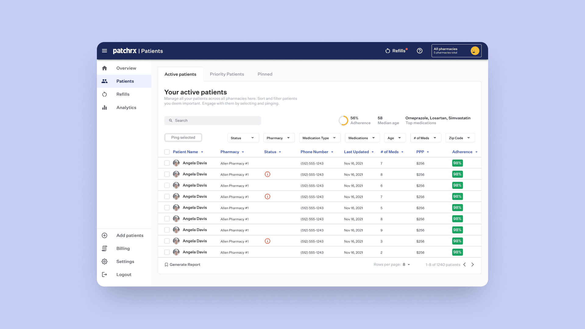
Revamped the web application to process intricate medication compliance information and generate valuable insights and tasks for nurses overseeing remote patient therapy.
Shipped a minimum viable product that generated an average of $186 per patient per month for primary care providers as well as net the company $4,000,000 in revenue 12 months after shipping.
Improved patient health outcomes through our robust data analysis for nurses monitoring medication adherence of high-risk therapies.
Launching a product that successfully closed a Series A funding round, securing 8 million dollars in investments.
+$186
Reimbursements earned by providers per patient per month
$4,000,000
Revenue in 12 months after shipping MVP
+40 clinics
Deployed nationwide
Process
Research & Analysis: I conducted user interviews and surveys with nurses and primary care providers to understand their pain points and user needs. We found that nurses oftentimes were monitoring large amounts of patients at once and needed to figure out a way to make billing and tracking these therapies easy.
Information Architecture: Based on the research findings, we restructured the way the webapp presented adherence data and tasks for nurses in a way that was simple to understand and automatically prioritized based on patient-risk.
Wireframing & Prototyping: We designed low-fidelity and high-fidelity wireframes to visualize the new layout and navigation, iteratively refining them based on user feedback with clinics.
Usability Testing: We conducted usability tests with a diverse group of users to validate the design and identify areas for improvement. Based on the feedback, we made necessary adjustments to the design.
Visual Design & Style Guide: We developed a cohesive visual language, including color schemes, typography, and iconography, ensuring consistency throughout the app. We also created a style guide to maintain design consistency in future updates.
Conclusion
Throughout this process, we took the guess work out of prioritizing the tasks nurses needed to perform by simplifying the most overwhelming parts of the user experience, assessing numerous patient therapies and investigating non-adherence events. We leveraged user insights and feedback from testing with nurses and providers to deliver a product that had depth without being overwhelming.


